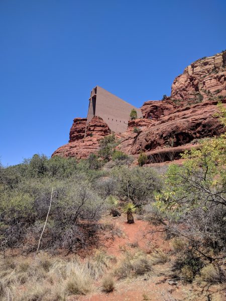
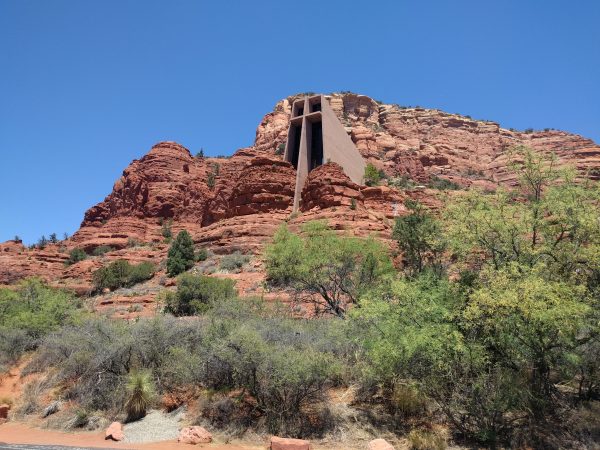
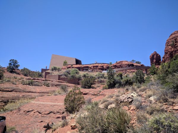
I recently visited Arizona with my son and was taken by its natural grandeur. I didn’t realize how much variation in geology and elevation there was, nor was I prepared for how moved I/we would be by these wonders. As we were leaving Sedona, I saw a sign that pointed to “Chapel of the Holy Cross”. I wasn’t familiar with it, but it must be cool if it merits a sign along the highway. So, as we do on vacation, we made a detour to check it out.
Upon arrival, I knew there was a perfect teaching moment for my son regarding design. Along with “WOW!”, here are the things I expressed to my son, which I think apply to everything. They are:
Integration Communication Distillation
Integration
Every client has needs; every site has requirements. These must be blended seamlessly to make something that is functional, beautiful, and (most importantly) appropriate. In this case, a rugged grouping of red rocks were used to place a diminutive chapel in the high desert. The result is unexpected, powerful, ingenious, poetic, and clear.
Communication
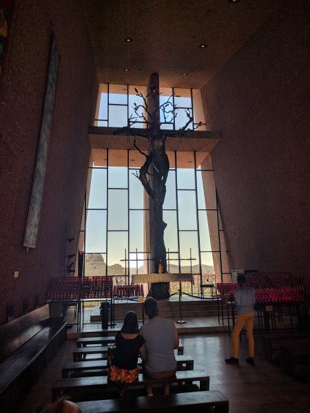
Not every client has a liturgy, a history, and its own iconography – but when they do, better make the best of it! In this case, the simple icon of the cross was used as signage on the face of the chapel (to those outside) as well as the focal point to those who had entered.
Distillation
The simplicity and clarity of form, the ease of understanding and use of the building, the abjectly contemplative nature of the chapel, and the pilgrimage one had to take to reach it (a long and circuitous approach) succinctly and articulately expressed the nature and purpose of this place.